Okanagan Spring Brewery - Packaging Design

Project Overview
Sleeman Breweries’ Okanagan Spring Label was getting into the creative mood, unveiling a new campaign for their summer brew, one of the most decadent beer-drinking seasons of the year.
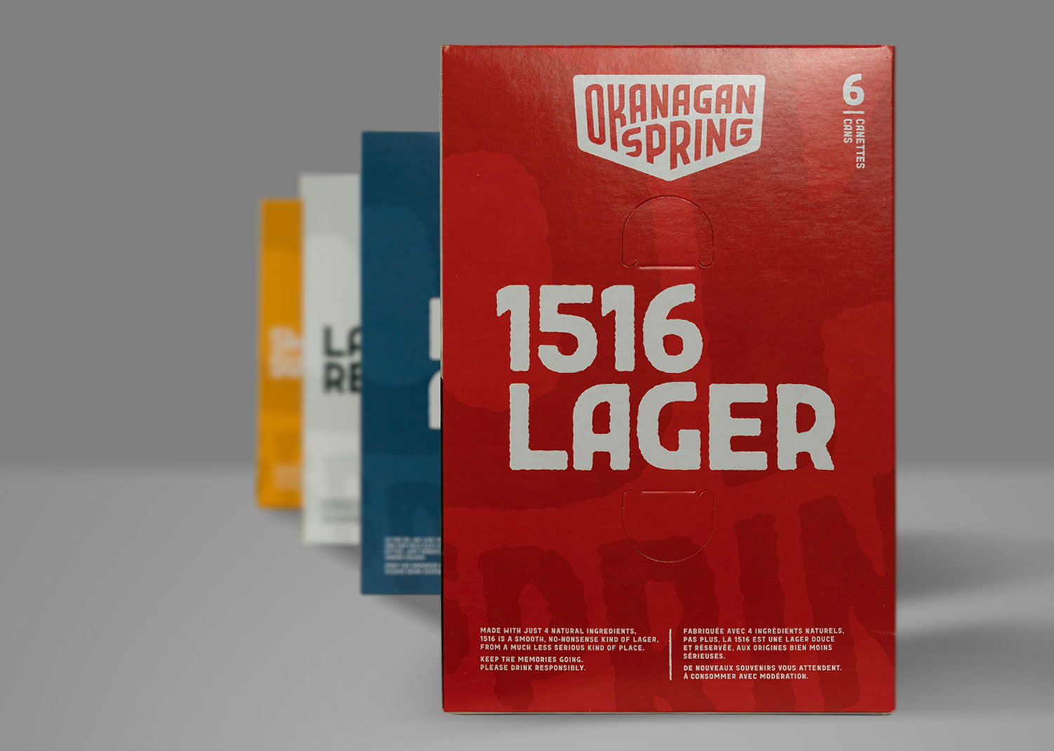
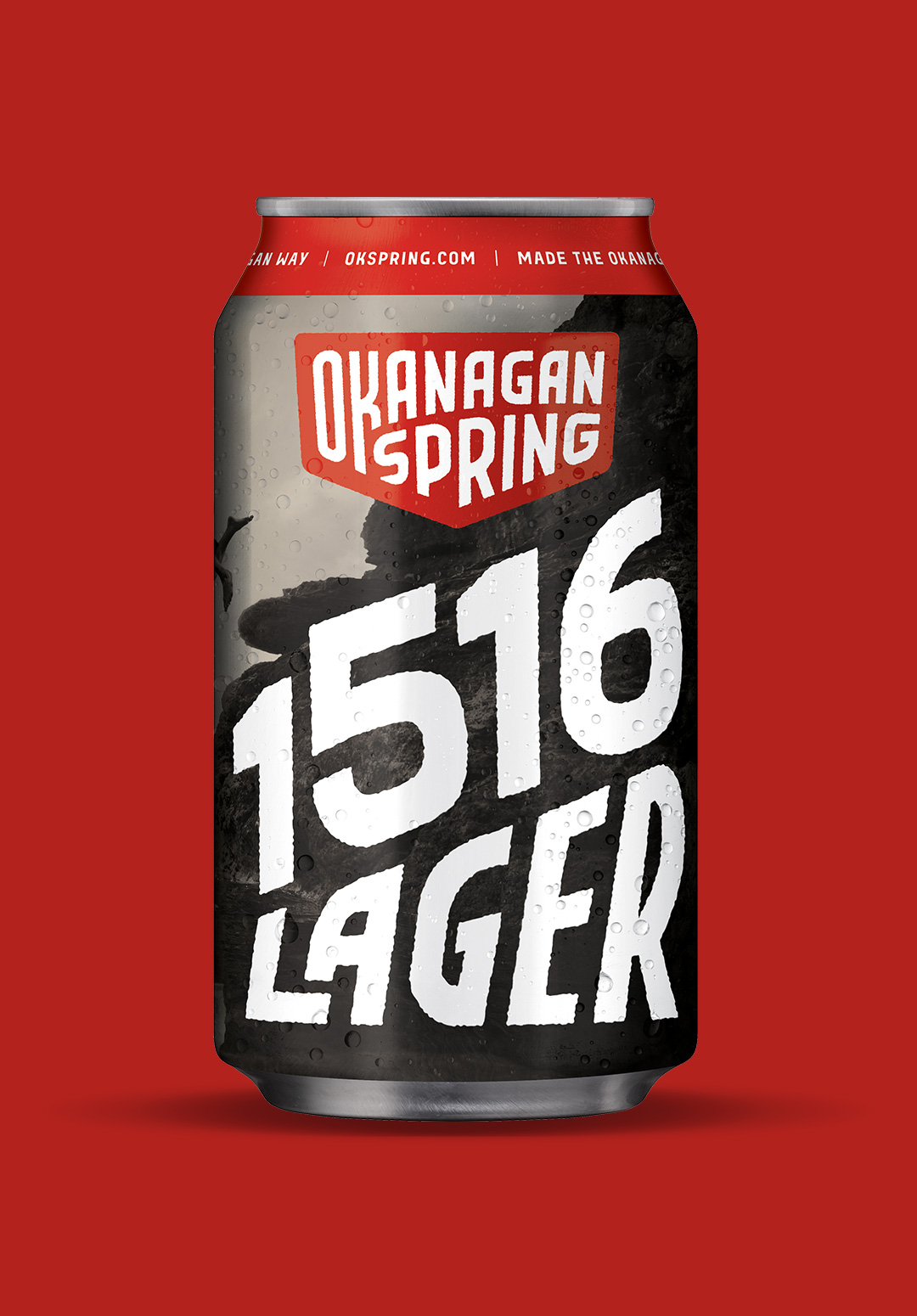
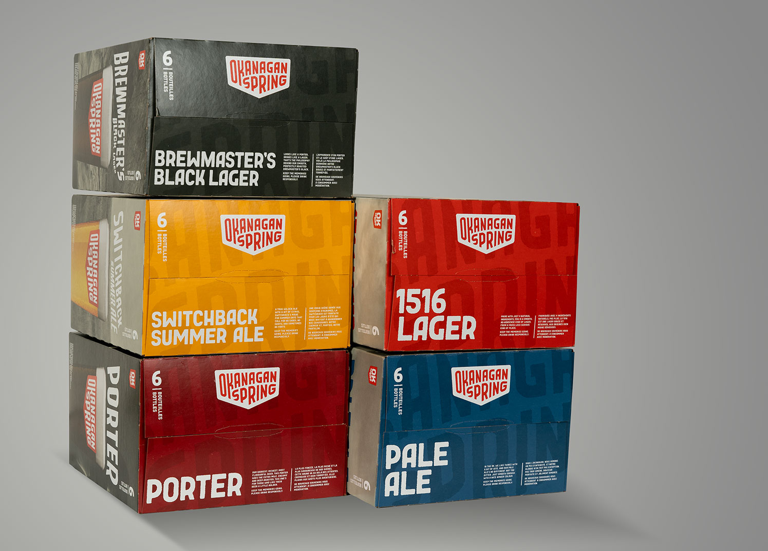
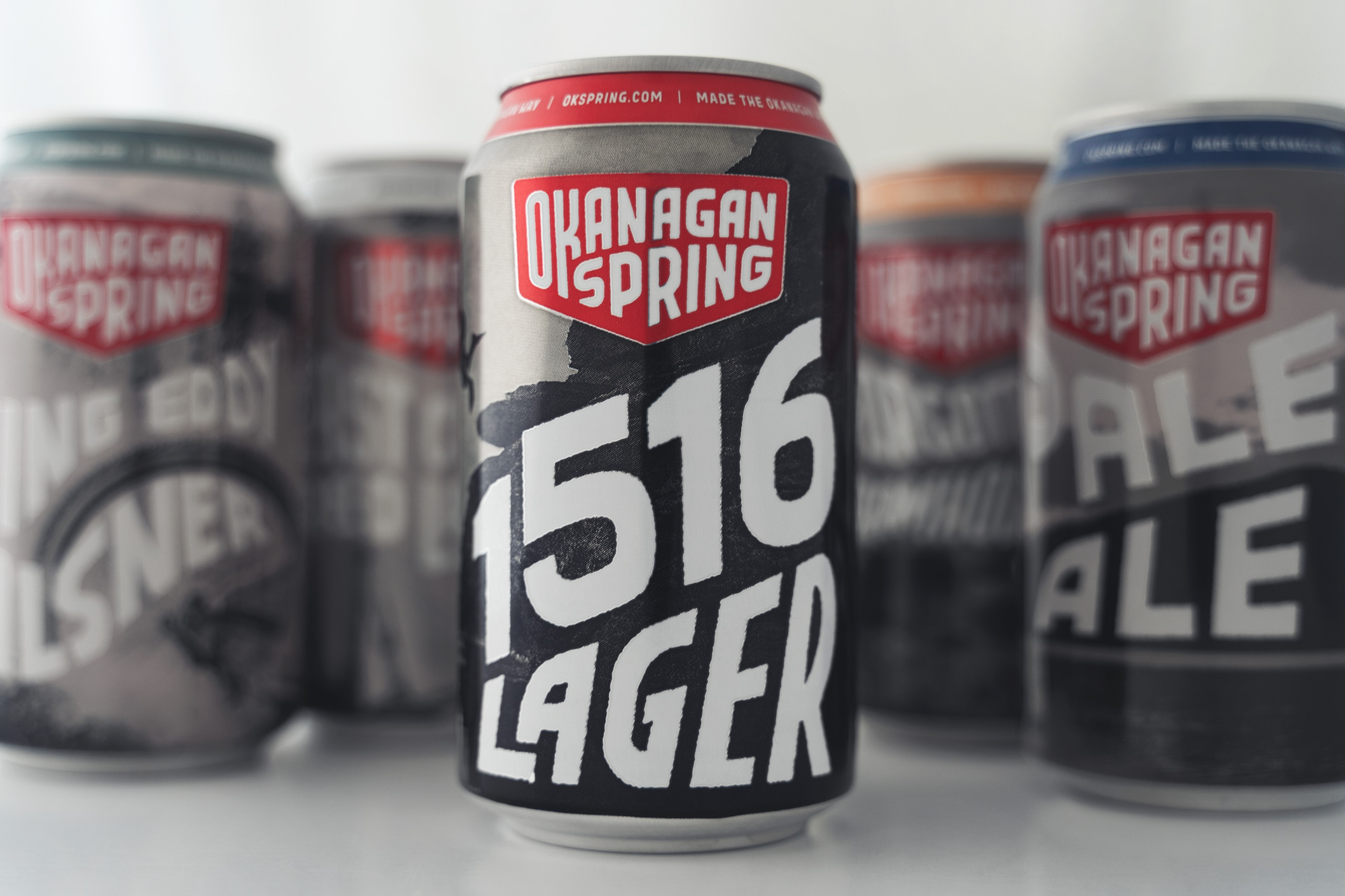
The new campaign also looked at adaptive redesigning and packaging for its cans and bottles. It was essential to stay within the guidelines of the brand’s core attributes of quality and drinkability.
The brief was to have an adaptive look to their variety of beers, bottles, and packaging that didn’t take itself too seriously. They still wanted to maintain their personality and instill their heritage from the Okanagan.
At Rayment & Collins, we achieved the task with its colourfully diverse and keen competition in the beer market.
Building on a brand known for its quality and taste, the goal was to acknowledge the Okanagan spirit and its attributes with a little more energy and fun.
It was one smooth workflow from design conception to adaption. We took the work to prepress, and then the print was produced all in-house.
We adopted new creativity to each variety of beer, applied the artwork to various pack sizes for the cans and bottles, photographed and retouched the products for packaging and POS material, colour-proofed and tested for quality control; printed, packed, and shipped to vendors and outlets; and most notably designed the art and photography to coincide with their social media and web campaign.
Services
- Design
- Pre Press and Pre Press Packaging
- Photography
- POS Material for Retail
- Social Media Content
- Imagery